🔋 Singularity Map / Build your energy community Web Based (B2B/B2C)
Grid Singularity is transforming energy usage through an innovative energy exchange market powered by blockchain technology. By facilitating peer-to-peer energy trading among citizens, companies, and NGOs, it aims to democratize energy consumption from households to industrial levels, promoting renewable sources like solar panels and wind turbines.
Grid Singularity envisions a sustainable, inclusive, and democratic energy market, empowering individuals and communities to make informed energy decisions.
My Role
As the Product Designer, I played a central role in the design and development of the Singularity Map. My responsibilities included:
- Leading the design process alongside the Design Lead.
- Conducting workshops to identify pain points and opportunities for improvement.
- Brainstorming and defining the MVP1 scope.
- Creating pixel-perfect designs and ensuring alignment with developers.
- Gathering and incorporating user feedback post-launch to enhance the product.

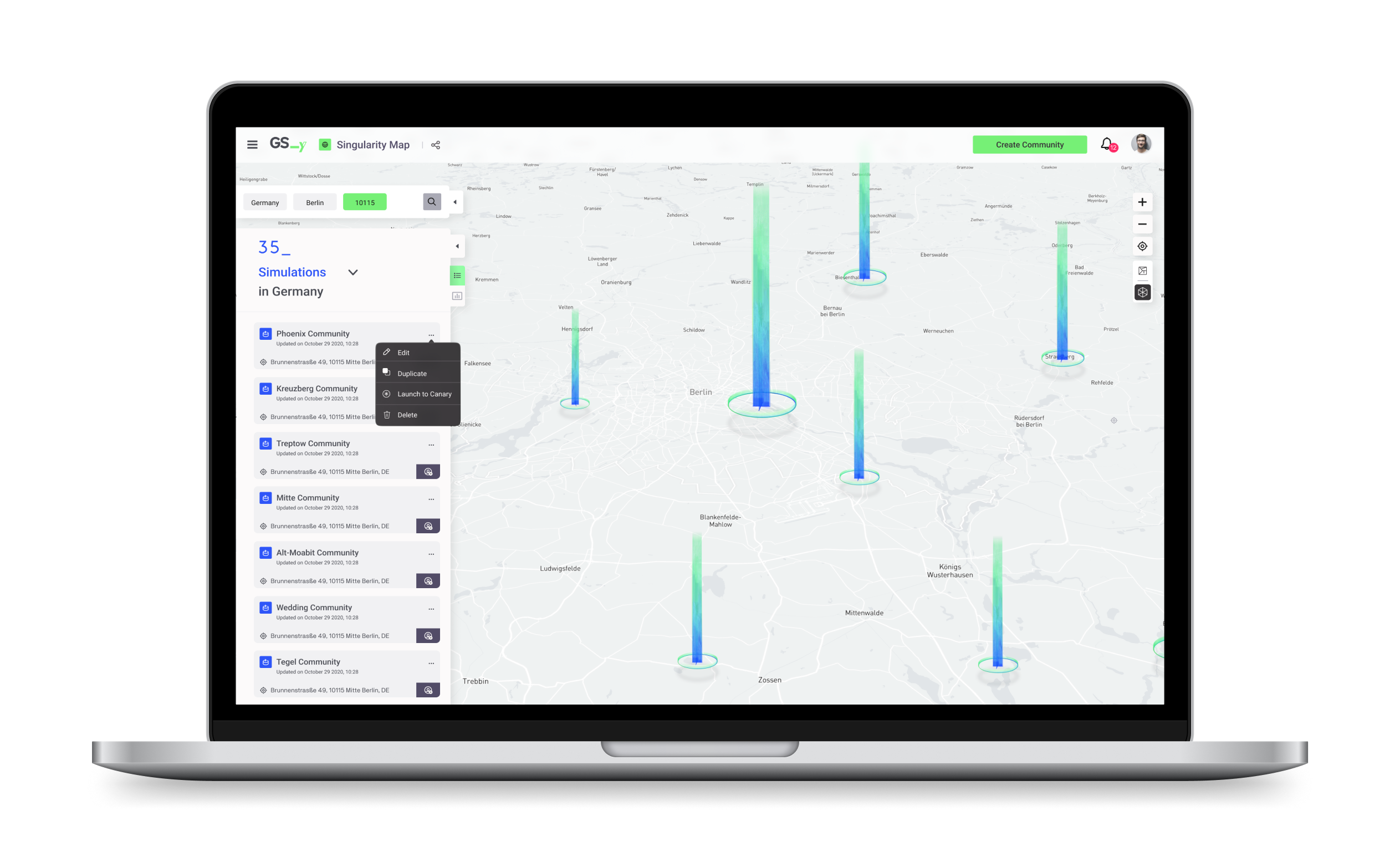
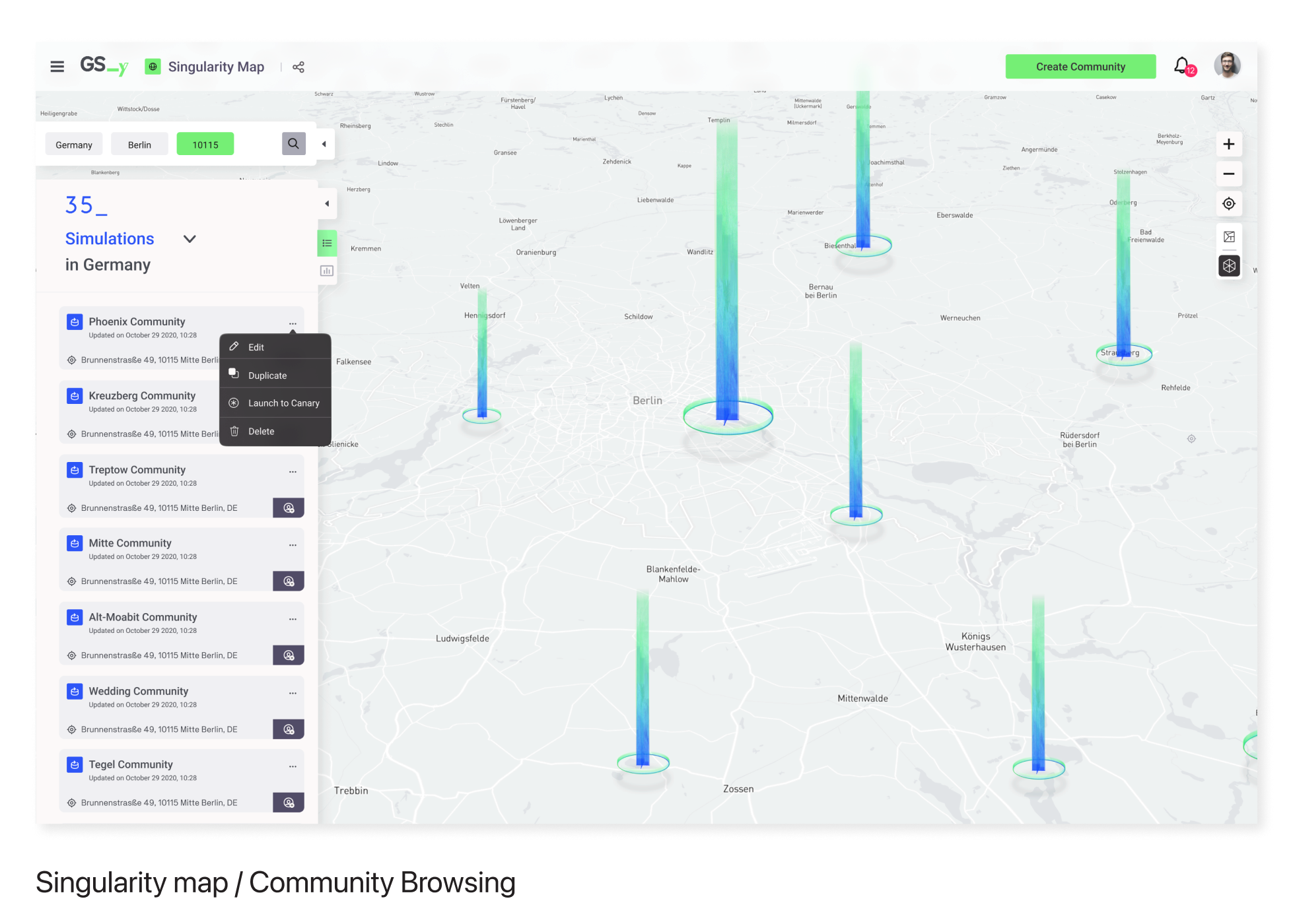
Singularity Map
We developed and launched the Singularity Map, an interactive tool enabling users to create and simulate community energy setups. This allows users to understand consumption patterns and make informed decisions on energy trading and hardware upgrades.
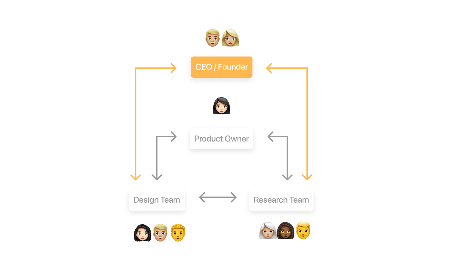
Team Setup
Our team comprised a Lead Designer, myself as the Product Designer, and a Junior Designer. We maintained autonomy while ensuring continuous communication with the CEO and Product Owner (PO). This collaborative approach ensured our design decisions aligned with business objectives.
Project Timeline
Step 1: Understanding Workshop with PO and CEO We conducted a one-week workshop to analyze the previous UI and identify pain points, essential for a successful product relaunch. (1 week)
Step 2: Brainstorming Solutions for Product Enhancement Inspired by Google Maps' simplicity, we brainstormed solutions to create an engaging interface for interacting with energy communities. (1 week)
Step 3: Design Redefinition We defined the MVP1 scope and began designing the product, incorporating contemporary UI trends. (3 months)
Step 4: Design Delivery Package. We prepared pixel-perfect designs, documented them on Figma, aligned with developers, and made necessary adjustments based on their feedback. (1 month)
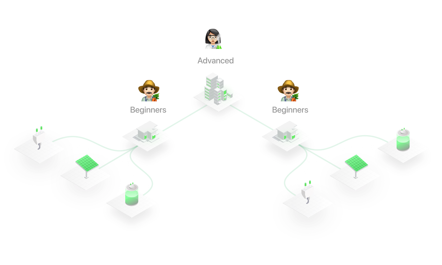
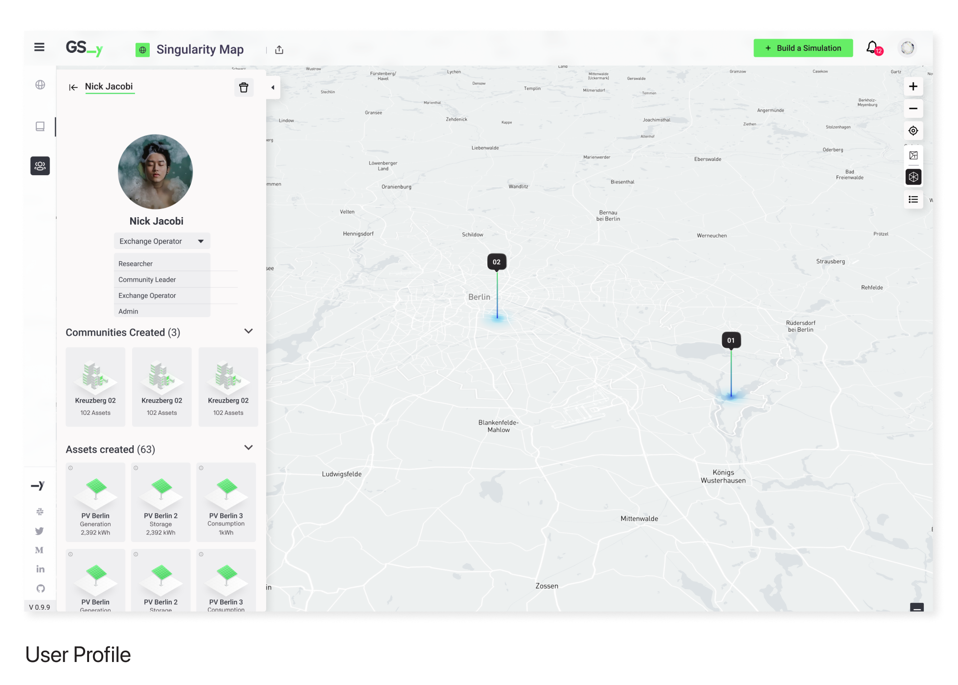
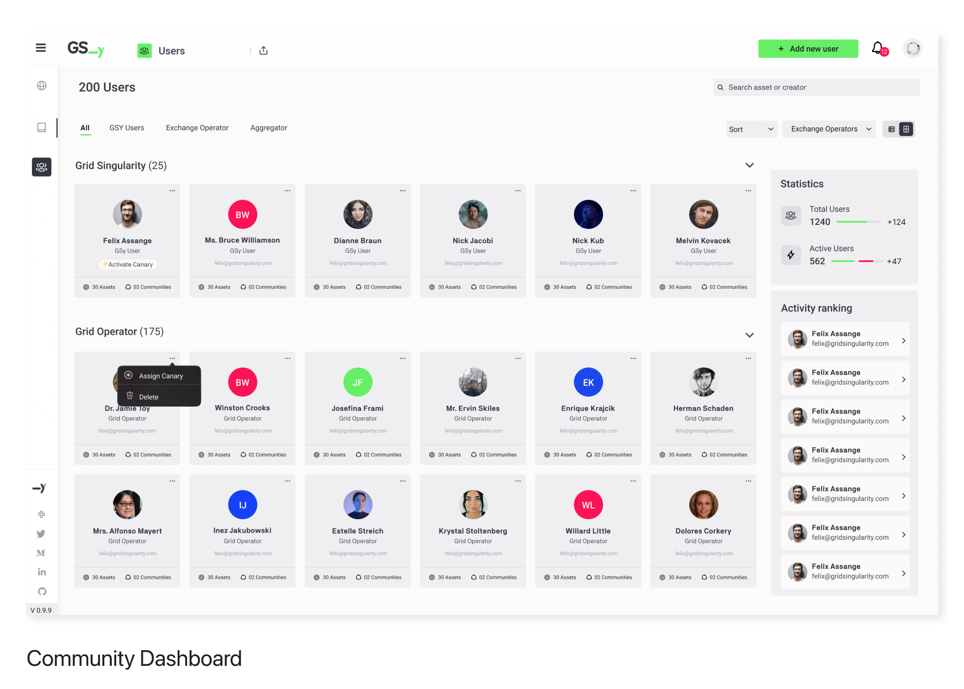
Users
We identified two primary user groups with distinct needs:
Beginners (Household owners, farmers, small business owners)
- Set up houses within designated communities
- Trade energy with neighbors
- Understand energy consumption
Advanced Users (University researchers, community leaders, hardware providers)
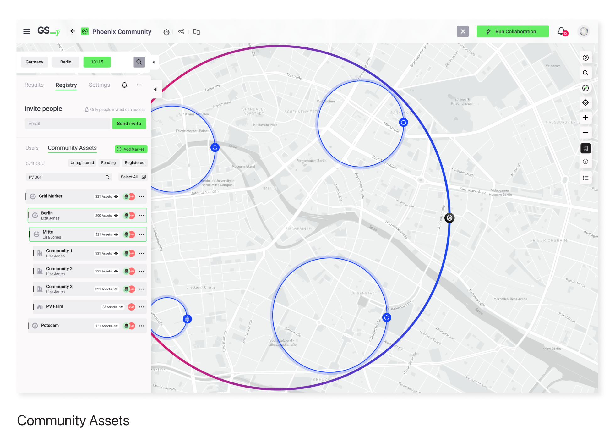
- Establish local energy markets by searching nearby communities
- Create and manage communities
- Utilize simulation results for research
- Sell excess energy
- Purchase energy from other communities
- Understand energy behavior to upgrade assets (e.g., install new solar panels)
Design Process
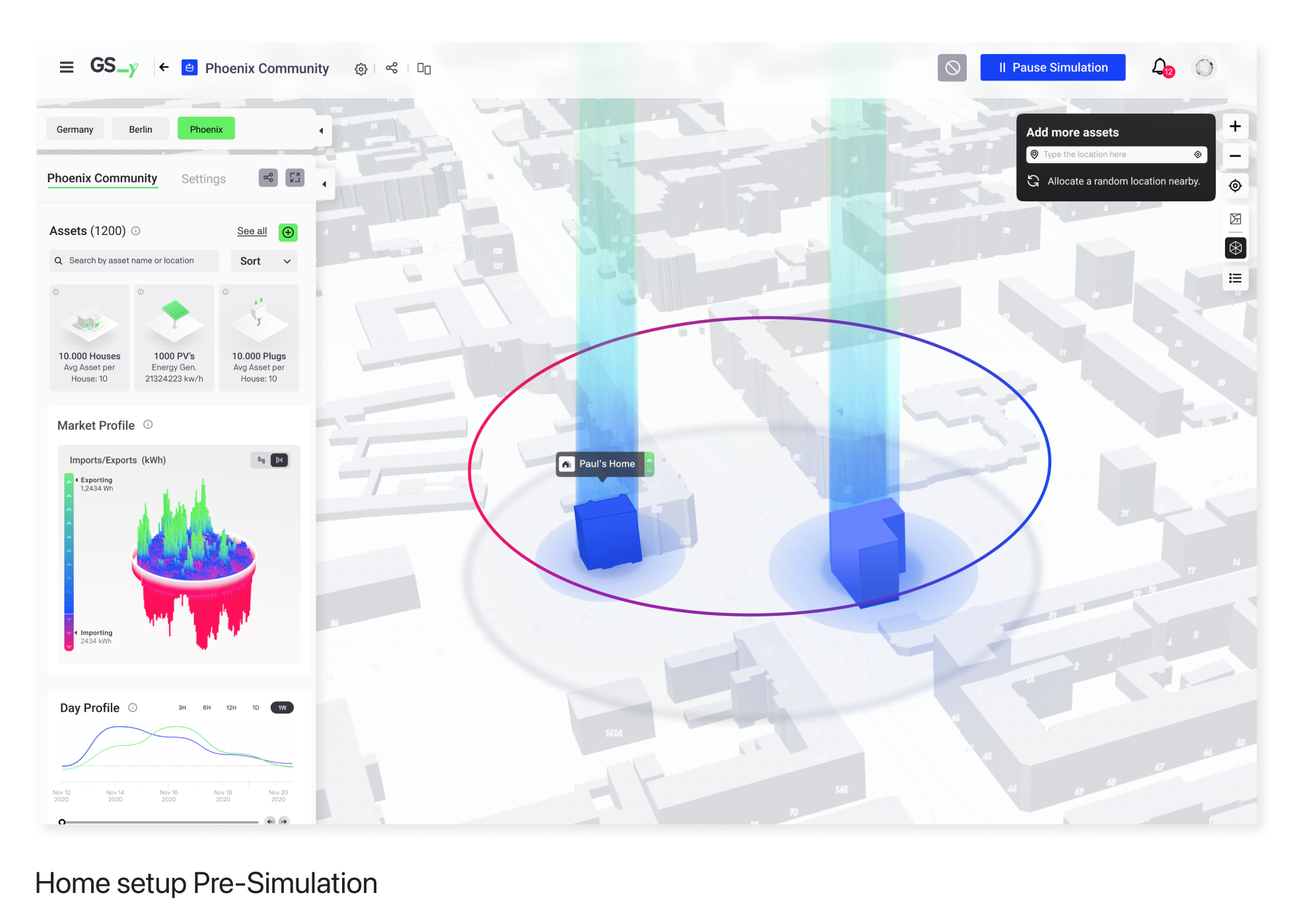
The map serves as the primary interface, allowing users to explore and create communities effortlessly. Users can create accounts in a few steps and start placing their houses on the map.
User stories were developed to guide the product's features, divided into pre-simulation and post-simulation states.
Pre-Simulation:
- Customize home and devices
- Select assets from a library or upload custom assets
Post-Simulation:
- Run simulations to obtain data for community management
Final Designs


Iteration and Improvement (Post-Launch)
Regular meetings with the Product Owner allowed us to gather user feedback and prioritize feature enhancements. We used a feature prioritization matrix to streamline decision-making and assigned features to designers for implementation.
Continuous iteration led to the development of features like the Help Center, addressing user needs and improving the overall experience.
Challenges
Before the launch, we conducted multiple usability testing sessions via Hangouts with real users to gather feedback. The main issues identified were:
- Hesitation in approaching the map
- Random clicking to guess the next step
- Misunderstanding of some icons
- Uncertainty about community creation
New Feature: Help Center
The ideation of this new feature was a consecuence of the user testing.
I took full ownership of designing the Help Center, from defining the user story and crafting the solution to supporting its implementation and delivery. This feature significantly enhanced the user experience.
Testing and Insights:
- We used Hotjar's Heatmap report to analyze user navigation patterns.
- Prototype testing with five users helped determine the optimal positioning and relevance of the Help Center content.

Dictionary: Brief description of the assets available for building communities in the map eg: Solar Panel, Default Community, etc.
Onboarding: Available onboardings will show up here. For now only one is developed: “Bild your community”
Tutorials: All relevant videos created for supporting the GSy users. The source of this videos comes from Youtube.
This approach, combining user feedback and data-driven insights, enabled us to fine-tune the Help Center, ensuring a seamless and intuitive user experience.
Added Value and Impact
Empowerment through Information: By providing an intuitive interface for creating and simulating energy communities, users gained a clear understanding of their energy consumption patterns and trading opportunities. This enabled more informed decision-making, driving engagement and satisfaction.
Enhanced User Experience: The design improvements, inspired by the simplicity of Google Maps, made navigating and interacting with the platform effortless, particularly for beginners. This ease of use was critical in reducing user hesitation and enhancing overall user adoption and engagement.
Data-Driven Enhancements: Utilizing tools like Hotjar for heatmaps and conducting usability tests allowed for precise identification of pain points. The subsequent iterations and the introduction of features like the Help Center significantly improved usability, addressing user concerns and fostering a better overall experience.
Support for Advanced Users: For advanced users such as researchers and community leaders, the ability to simulate energy setups and analyze results provided valuable insights for managing local energy markets. This support for advanced functionalities ensured the platform catered to a broad spectrum of users, enhancing its utility and relevance.
Sustainable Impact: By facilitating peer-to-peer energy trading and promoting renewable energy sources, the Singularity Map aligned with Grid Singularity’s vision of a sustainable and democratic energy market. This not only supported environmental goals but also encouraged community-based energy solutions.
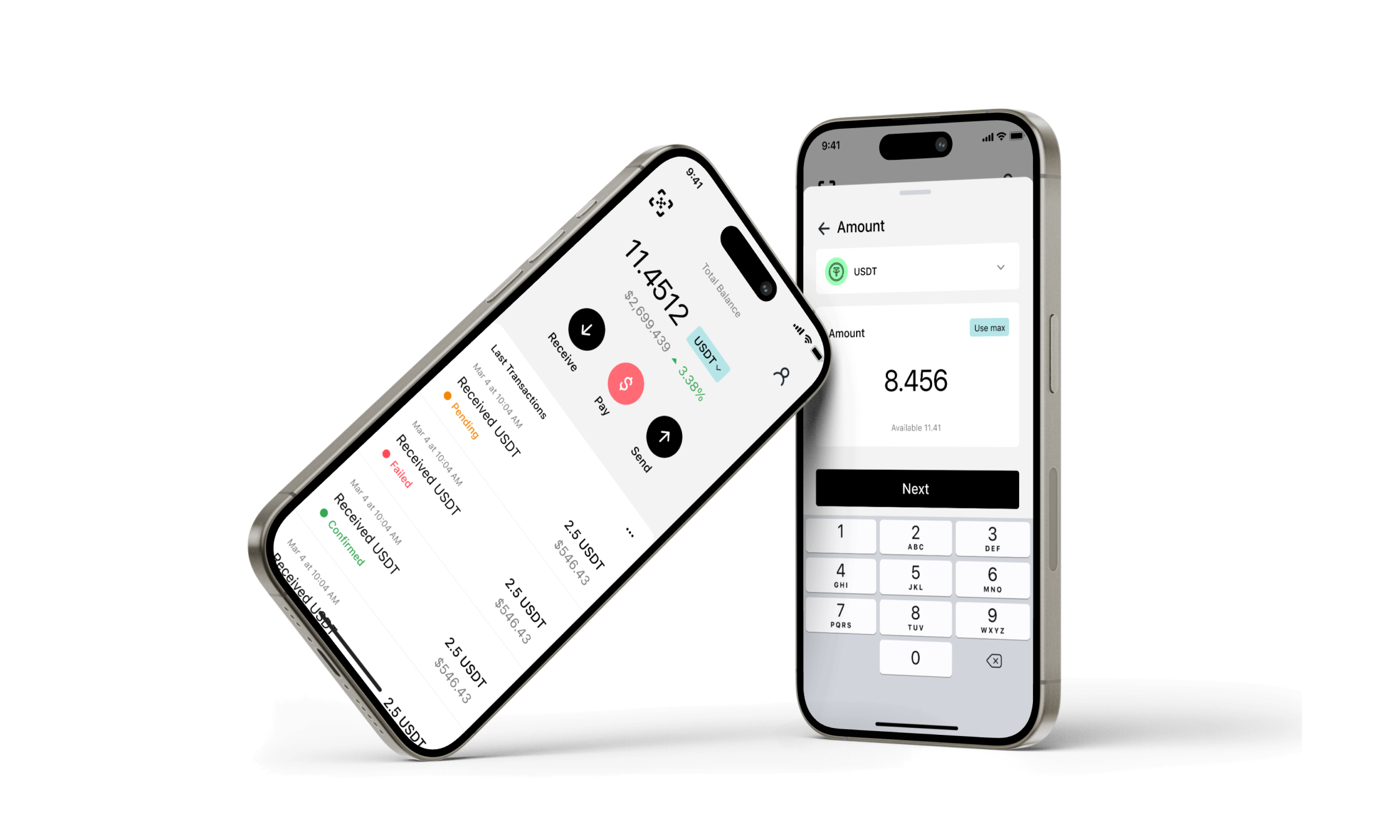
![]() 💰 Crypto Wallet / Paytera - Mobile App B2C (2022)
💰 Crypto Wallet / Paytera - Mobile App B2C (2022)
Paytera aims to revolutionize cryptocurrency usage in Latin America by providing a user-friendly platform that goes beyond a typical crypto exchange.
 💰 Crypto Wallet / Paytera - Mobile App B2C (2022)
My Role
As the sole Senior Product Designer for Paytera, my key contributions included:
UI/UX Design: Led the entire design process, from initial concepts to high-fidelity prototypes, ensuring a seamless user experience.
Competitor Analysis: Identified opportunities for differentiation through thorough competitor analysis.
Branding and Naming: Created the branding strategy and coined the name "Paytera."
Visual Design: Designed the app's visual identity, including color scheme, typography, and overall aesthetics.
Introduction
Serving as a Crypto Wallet, Paytera enables seamless sending and receiving of cryptocurrencies, along with the added benefit of earning cashback through its app. Users can store a wide array of cryptocurrencies, conduct peer-to-peer transactions, make crypto payments to businesses, and enjoy cashback rewards on purchases made via Paytera.
Key Features
Multi-crypto Support: Safely manage, trade, stake, and utilize various cryptocurrencies through a single, convenient application.
Instant Payments with Low Fees: Initiate payments at your favorite stores or send funds to friends with just a few clicks, all while benefiting from minimal transaction fees.
Earn Rewards: Receive crypto cashback rewards on every transaction made through the Paytera app, enhancing the value of your purchases.

Setting Paytera Apart
In a crowded market, Paytera stands out by offering unique benefits to both users and businesses:
For Users: Enjoy the flexibility of decentralized transactions, maximize savings with low processing fees, and receive instant funds with no setup fees.
For Businesses: Embrace cryptocurrency acceptance, diversify revenue streams, and enhance sales opportunities with a streamlined payment process facilitated by Paytera's QR code system.
UI Research and Redesign
Understanding the importance of user experience and visual appeal, Paytera underwent a comprehensive UI research and redesign process. Utilizing insights from competitor analysis while striving to differentiate itself, the UI transition focused on enhancing user-friendliness and adhering to established UX patterns within the crypto-wallet landscape.
Following discussions with the client, it was decided to opt for White Mode based on the findings of the UI research.

By integrating the original user flow with updated design principles, Paytera maximized usability while maintaining consistency with industry standards, ultimately positioning itself as a leader in the Latin American cryptocurrency market.
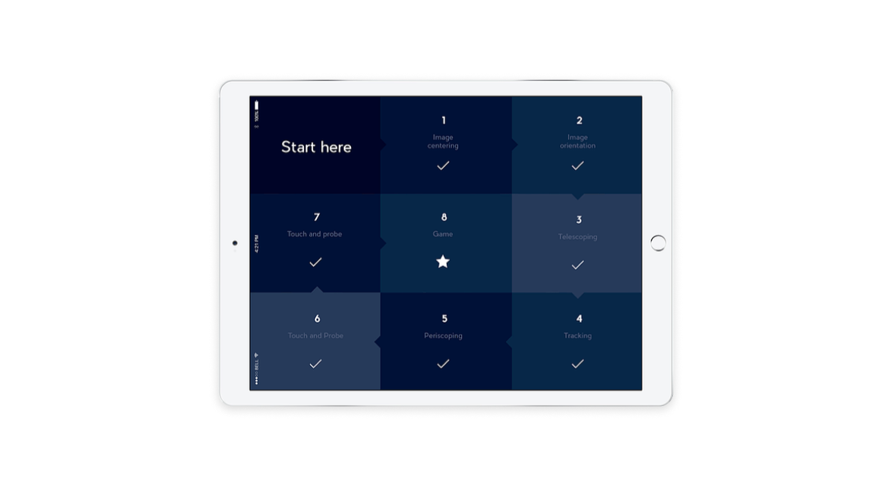
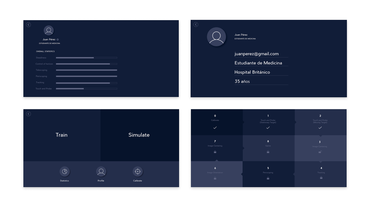
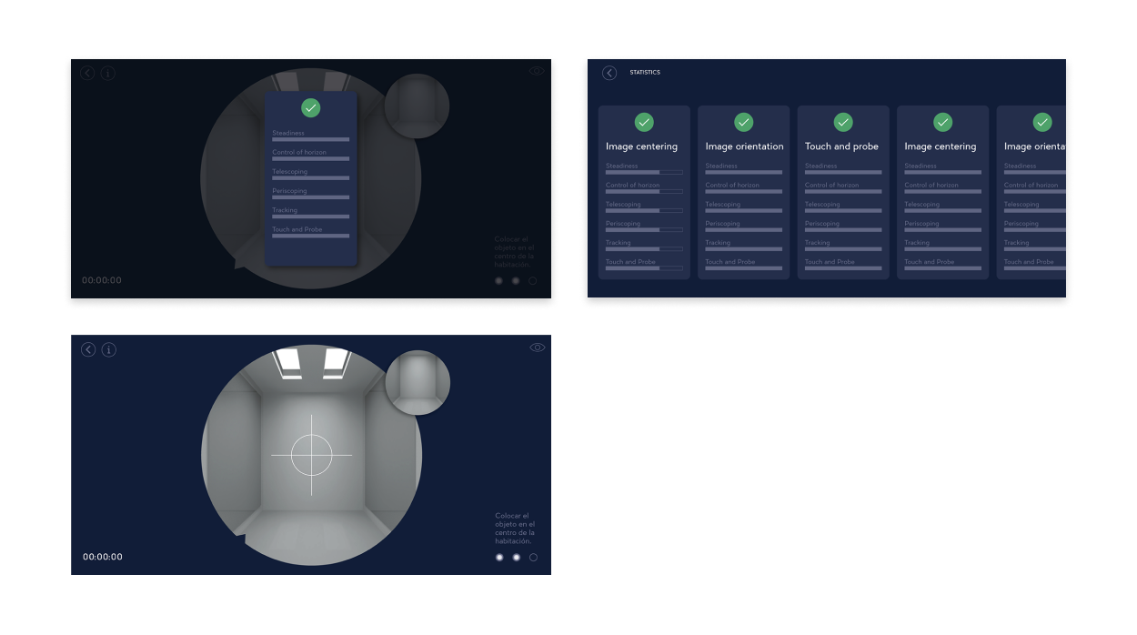
🩺 Dr Training / Educational AR App (2016)
Overview
Dr. Training is an educational Augmented Reality (AR) app focused on arthroscopy, a medical procedure involving body articulations. The aim of the app is to train doctors to develop the skills necessary for successful operations.
How It Works
Using AR technology, the simulation closely mimics a real medical procedure. The app provides a gamified learning experience where users learn new techniques step by step, unlocking new features as they progress. The camera reads the movements of a small paper instrument held by the user to simulate and practice the desired skills.Features
- Train: Develop basic skills to become a better surgeon.
- Simulate: Perform a real surgery simulation with no risk involved.
- Feedback: Receive automatic feedback on the overall process.
My Role
Brand Design Conception: I conceptualized the overall brand design for the app.
Logo Design: I created the logo, ensuring it was professional and aligned with the app’s educational purpose.
User Flow: I designed the user flow to ensure an intuitive and effective learning experience.
User Interface: I developed the user interface, focusing on usability and engagement.
Communication with Stakeholders: I maintained clear and consistent communication with stakeholders to align the app’s features with their expectations.
Viewport Design: I designed the viewport for the original iOS iPad version (1024x768px) and adapted it for Google Pixel 3a XL.
Challenge
The challenge was to create a realistic and engaging AR simulation that accurately represented a medical procedure while being intuitive enough for doctors to use as a training tool.
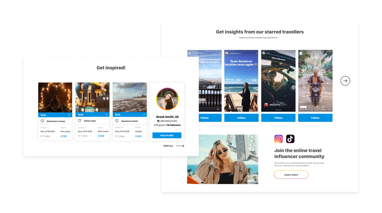
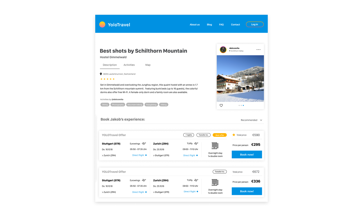
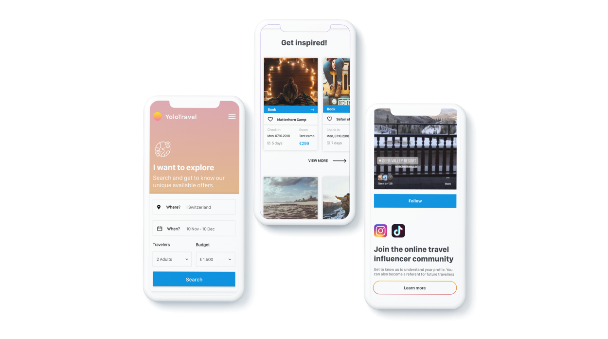
🏝️ Yolo Travel / Travel Experience (2018)
Overview
The Yolo Travel project was a design concept aimed at creating an inspiring and seamless travel booking experience. The platform allows users to search for vacation ideas, get recommendations, read reviews, and book their trips all in one place. Additionally, users can share their travel experiences and become online travel influencers. This project was a website concept developed in 2018.
My Role
Design Concept Definition: I defined the overall design concept, ensuring it aligned with the goals of inspiring and facilitating travel planning.
User Flow: I mapped out the user flow to create an intuitive journey from searching for vacation ideas to booking and sharing experiences.
UI Design: I designed the user interface for both the web-based app and its mobile version, focusing on creating an engaging and user-friendly experience.
Responsive Design: I ensured that the design was responsive, providing a seamless experience across desktop and mobile devices.
Challenge
The challenge was to create a cohesive and visually appealing platform that not only allowed users to book vacations but also inspired them through recommendations and reviews. Balancing inspiration with functionality was key to the project's success.
Additional Information
- Platform: Web-based app with a mobile version
- Design Tools: The project was designed using Figma. You can view the Figma file here.